Data Visualization
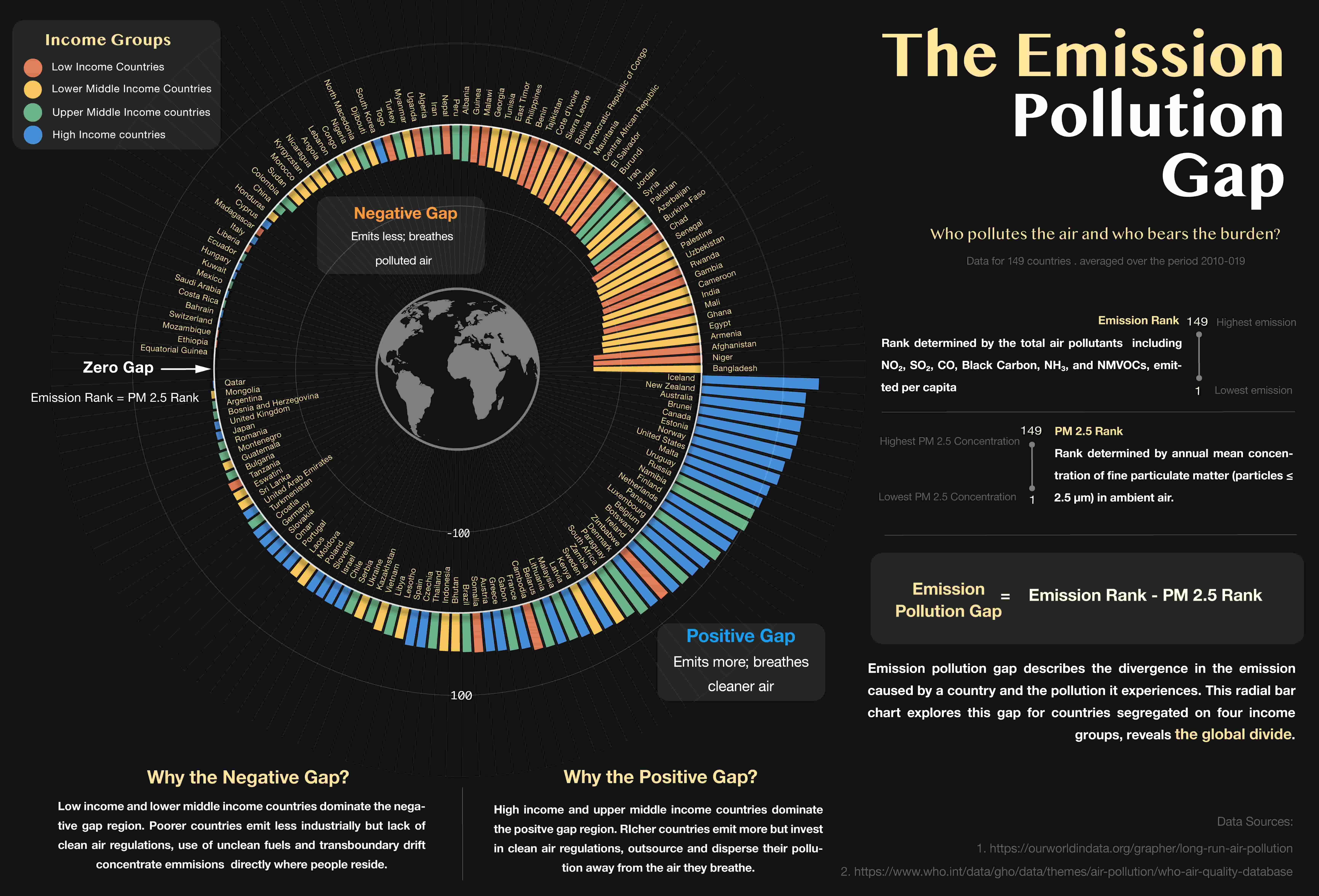
The Emission Pollution Gap
Who pollutes the air — and who bears the burden? An interactive dashboard and editorial infographic across 149 countries.
View live dashboard ↗Scientific Illustration · Data Visualization
I translate complex scientific and data stories into precise, evocative visuals
Who pollutes the air — and who bears the burden? An interactive dashboard and editorial infographic across 149 countries.
View live dashboard ↗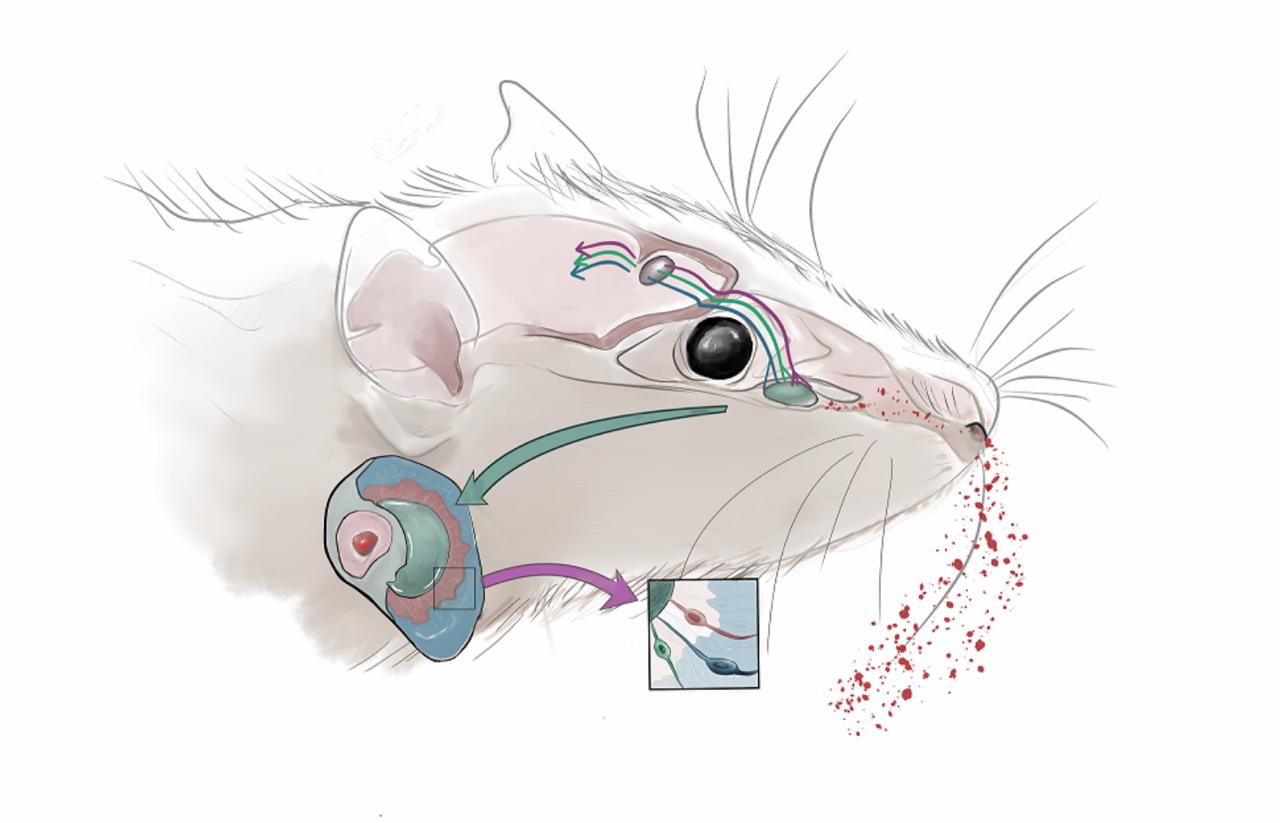
Pheromone processing in Mice VNO
About
I hold a master's in physics but have built my practice at the intersection of science and visual communication — first as a scientific illustrator, now expanding into data visualization and information design.
Read moreClients & collaborators